Why We Started with the Apple Watch
For many children, the first personal computer they wear is not a phone or laptop. It is a watch, often after an iPad. That changed where we started StackCalc. The Apple Watch was not a companion screen added after the calculator had been designed; it was the first place we had to prove that an RPN calculator could explain its next action in a very small space.
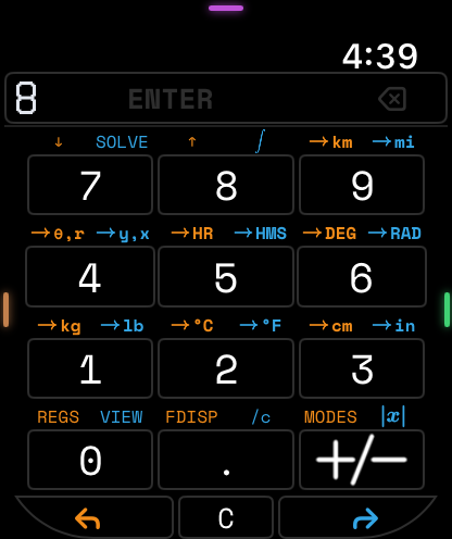
A small screen exposes the real priorities
A conventional calculator can hide uncertainty behind a large keypad, status area, menus, and a generous display. A watch cannot. There is no room for a long tutorial or a second row of rarely used controls. Every element has to answer a specific question: what value is being entered, what is already on the stack, what will ENTER do, and what operation can the user reach next?
That constraint led to a simple interface rule: preserve the calculation state before preserving visual resemblance to an older calculator. The visible stack and current entry get priority. A function that needs an explanation earns a clear path to it; it does not get squeezed into a cryptic touch target just because the physical calculator once had a key for it.
Use the watch to test an RPN explanation
RPN gives us a sequence that can be narrated. To make three quarters, enter 3, press ENTER, enter 4, then divide. On a small screen, the learner should be able to predict which values the division will consume before pressing it. That is why StackCalc also has fraction pieces, stack tiles, and expression-tree tokens: they give the same operation a physical explanation before it becomes a compact device interaction.
The Watch pushed the project toward a shared model instead of a collection of matching skins. The RPN core supplies the state transition. The Watch chooses a compact hierarchy. The iPhone and iPad give more room for labels and visible stack context. The forthcoming RP2350 handheld can add tactile key positions and a dedicated screen without changing what the sequence means.
Carry the constraint into hardware
The printed calculator prototype has a tool-free four-part assembly, a TPU membrane, a wide ENTER key, and a display opening shaped by the KiCad board layout. The board is in fabrication, but the interaction choices are already being exercised in the Apple apps and the RP2350 firmware emulator. A row-and-column matrix event reaches the firmware path; the compiled image updates a 132 × 65 framebuffer; the app and core give us another surface to compare against.
This is useful before electronics arrive because it turns a vague promise of “cross-platform” into a set of named checks. Does ENTER lift the stack in every target? Does an unfinished entry render consistently? Does a mode change preserve the same calculator state? When the board is populated, the same test recipes become board bring-up checks rather than a new list invented after the fact.
Build an ecosystem around the first device a learner has
The project is not trying to replace a child’s watch or convince everyone to abandon a phone calculator. It is trying to make RPN understandable wherever that learner already is. The Watch gives a first encounter; the iPhone and iPad make practice convenient; the Learning Lab gives teachers printable objects; and the handheld turns the shared behavior into a focused instrument.
The app is available on the App Store, and the StackCalc Learning Lab contains the public STL pack, reference cards, and teacher booklet. The hardware build record and printable mechanical materials are linked from the hardware guide. Source code remains private, but the project publishes the visual, printable, and teaching artifacts that explain the decisions.
The Watch was where we learned that the most important calculator feature is not a dense function list. It is confidence about what happens after the next press. That is the requirement we are carrying into every other StackCalc surface.